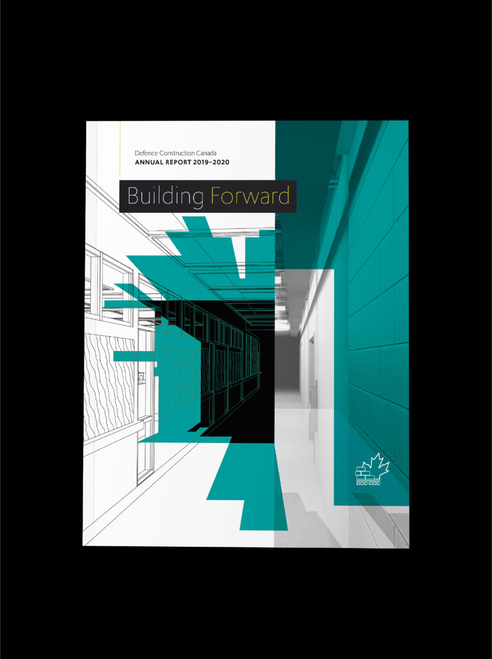
Crush It For Cancer

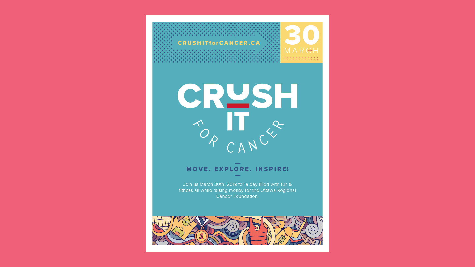

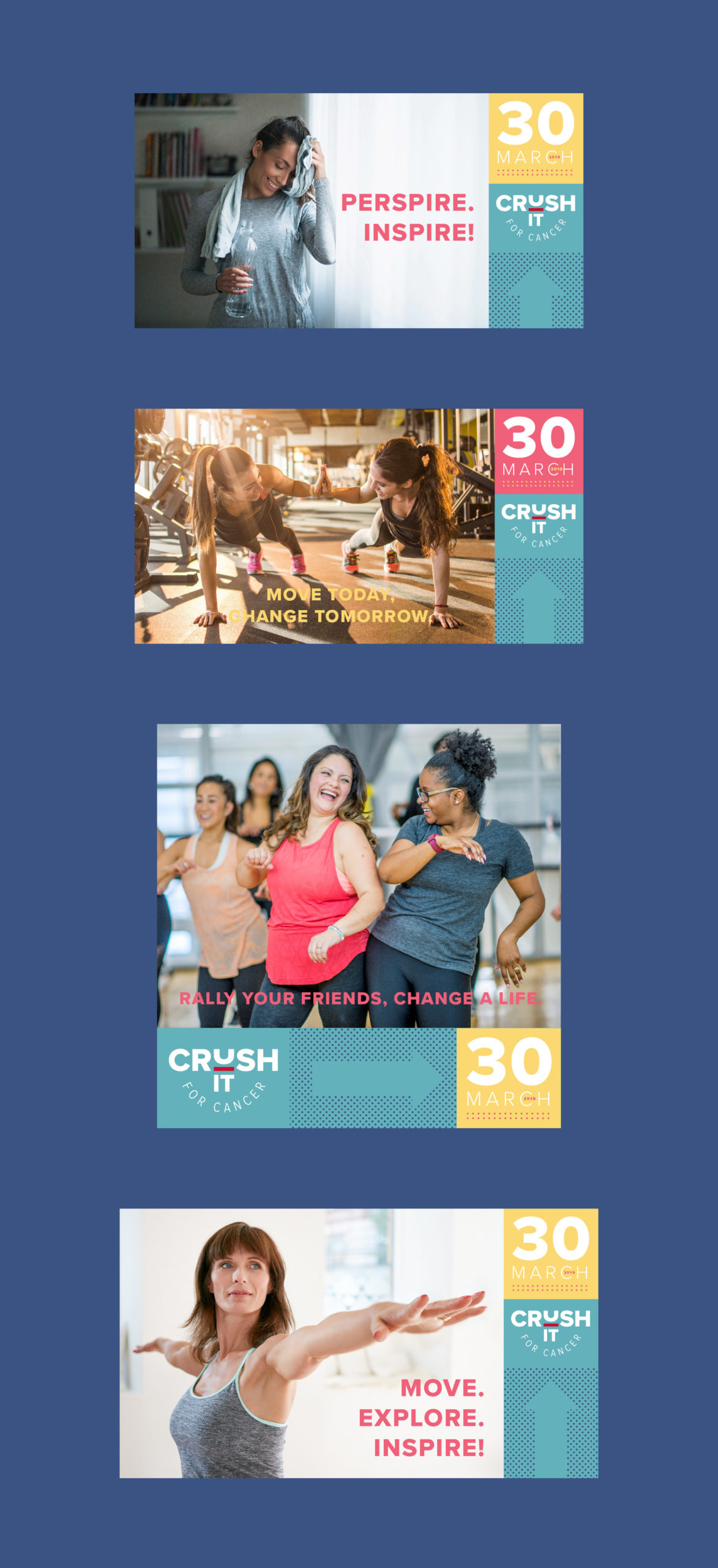
Crush It For Cancer
Crush It for Cancer was a large fundraising event being held at the Infinity Convention Centre. I was challeneged with creating not only the name for the event “Crush-It for Cancer”, but I also designed all the collateral as well.
My Role
Research · Strategy · Copywriting · Design · Layout
DCC Annual Report
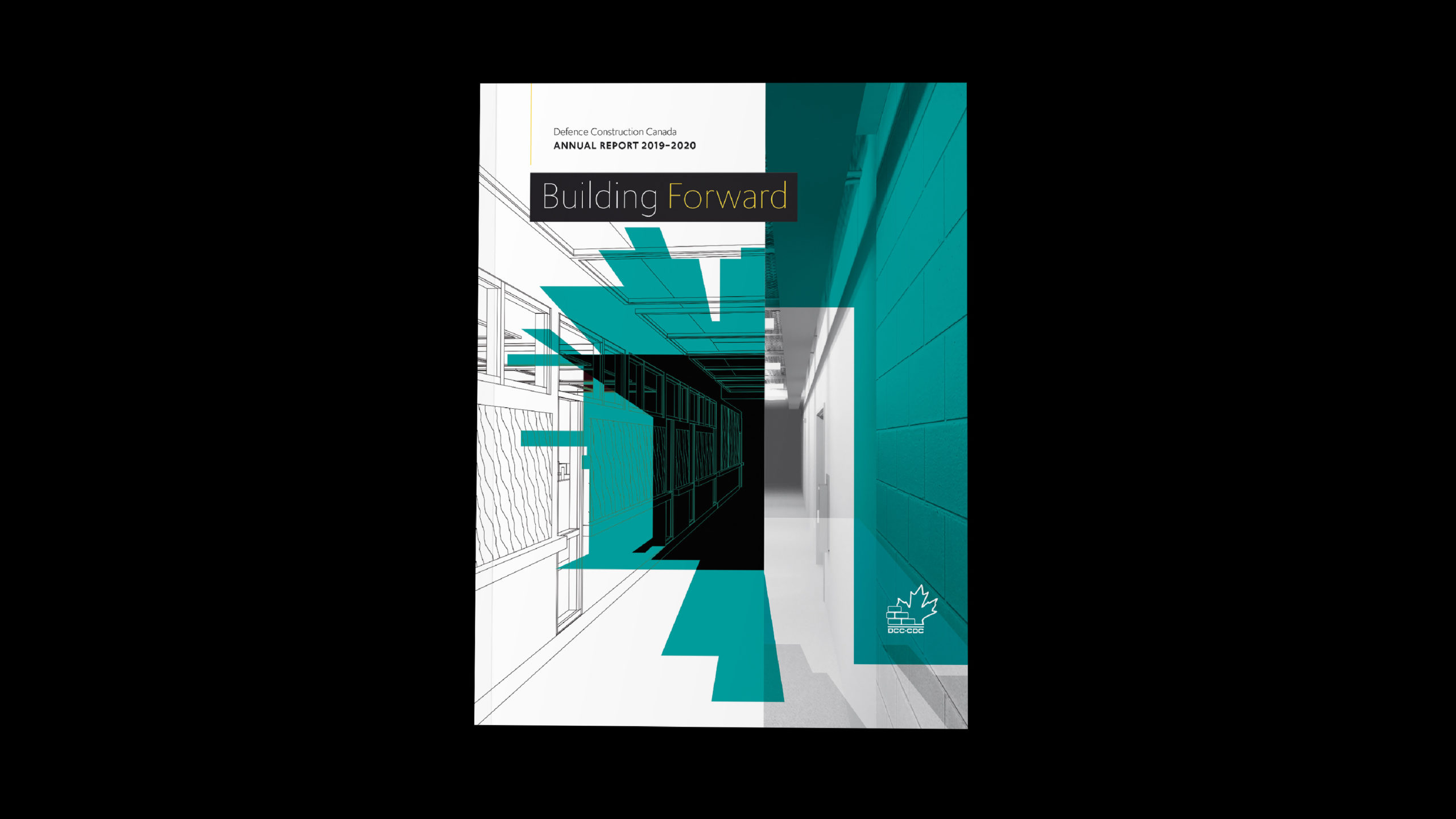

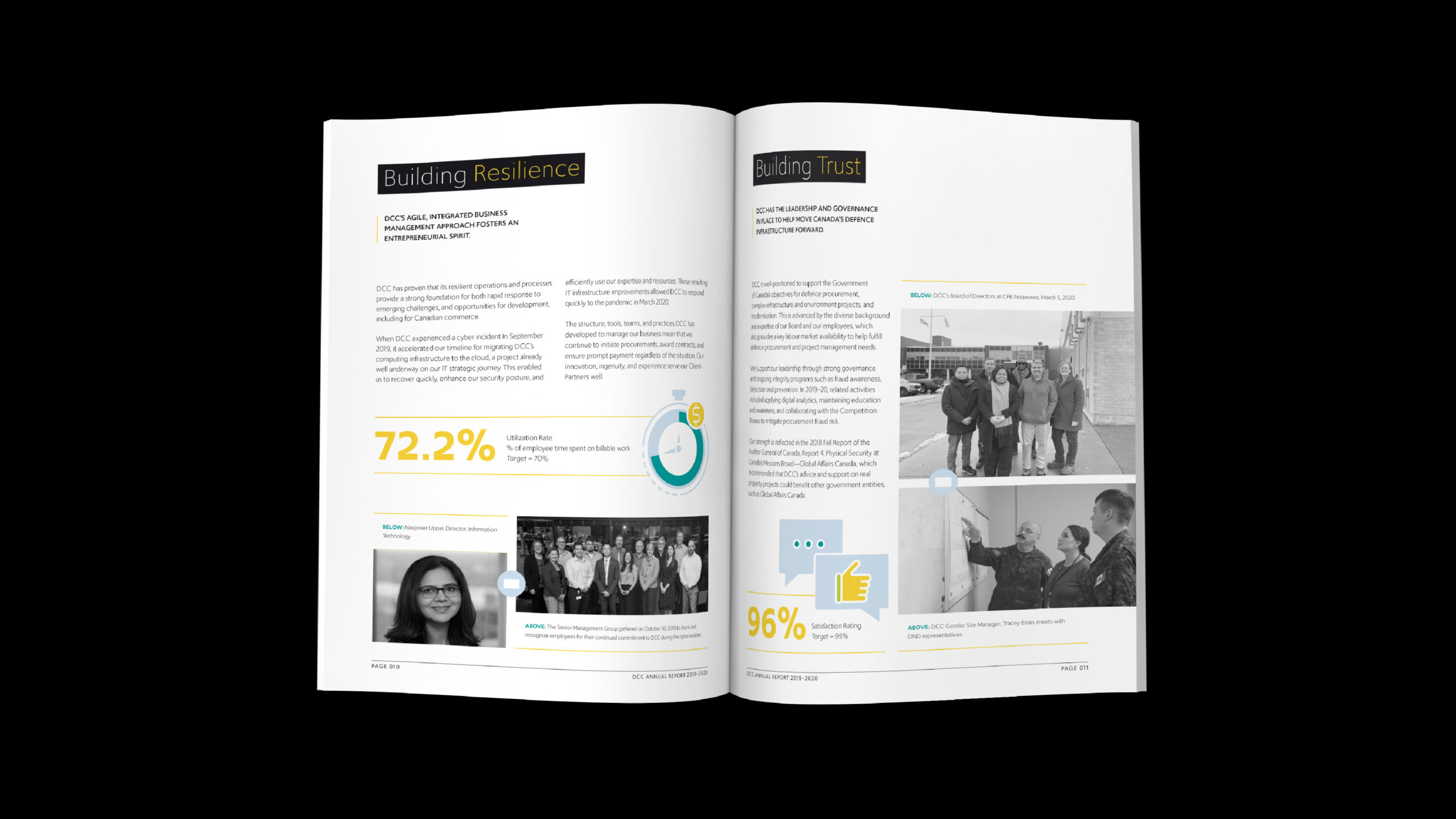
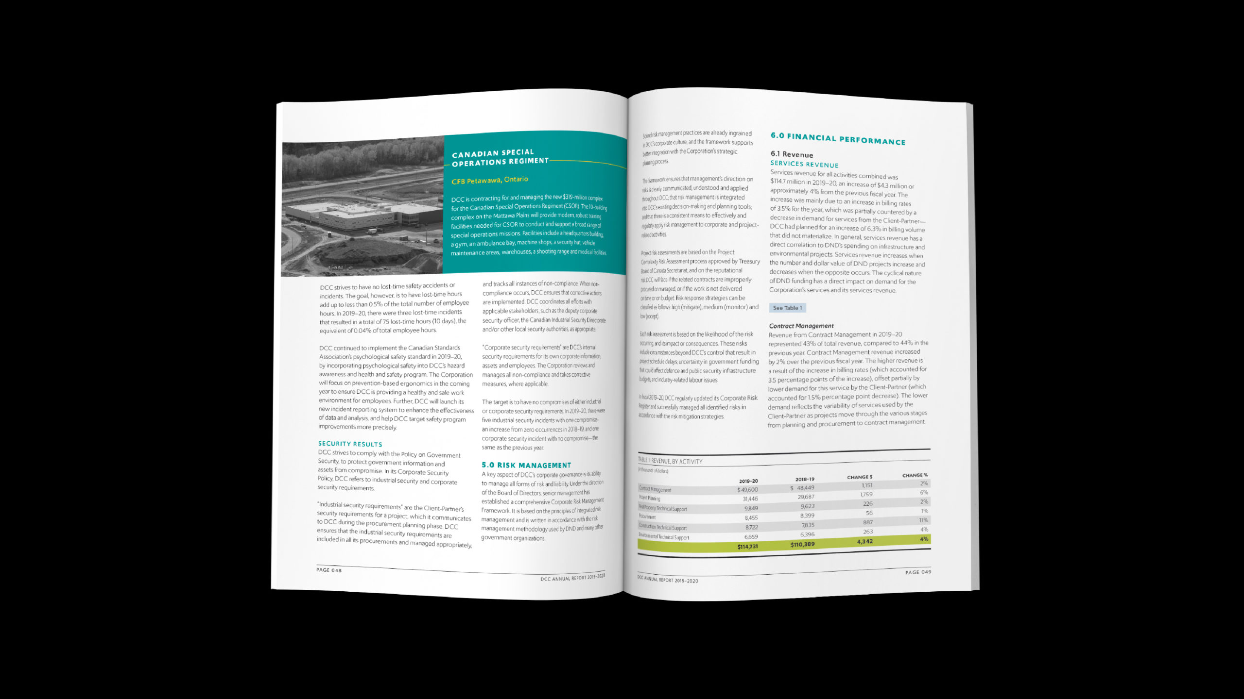
Defence Construction Canada
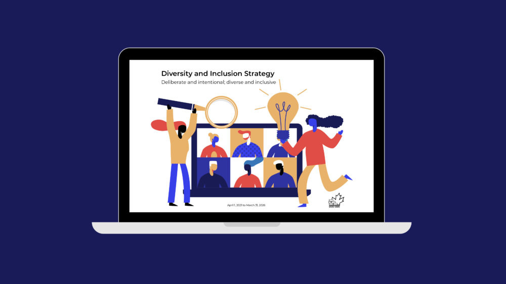
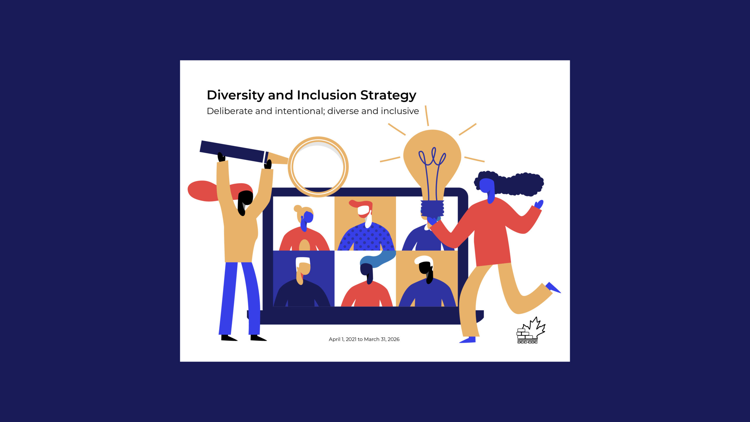
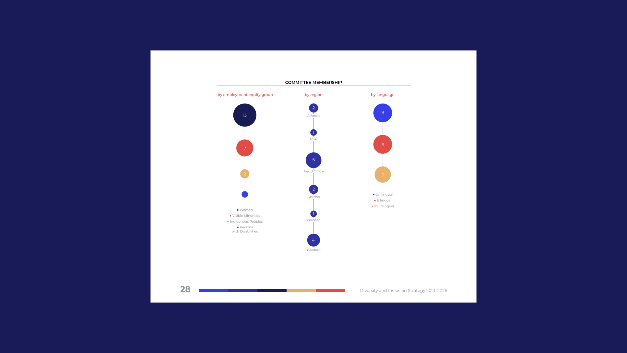
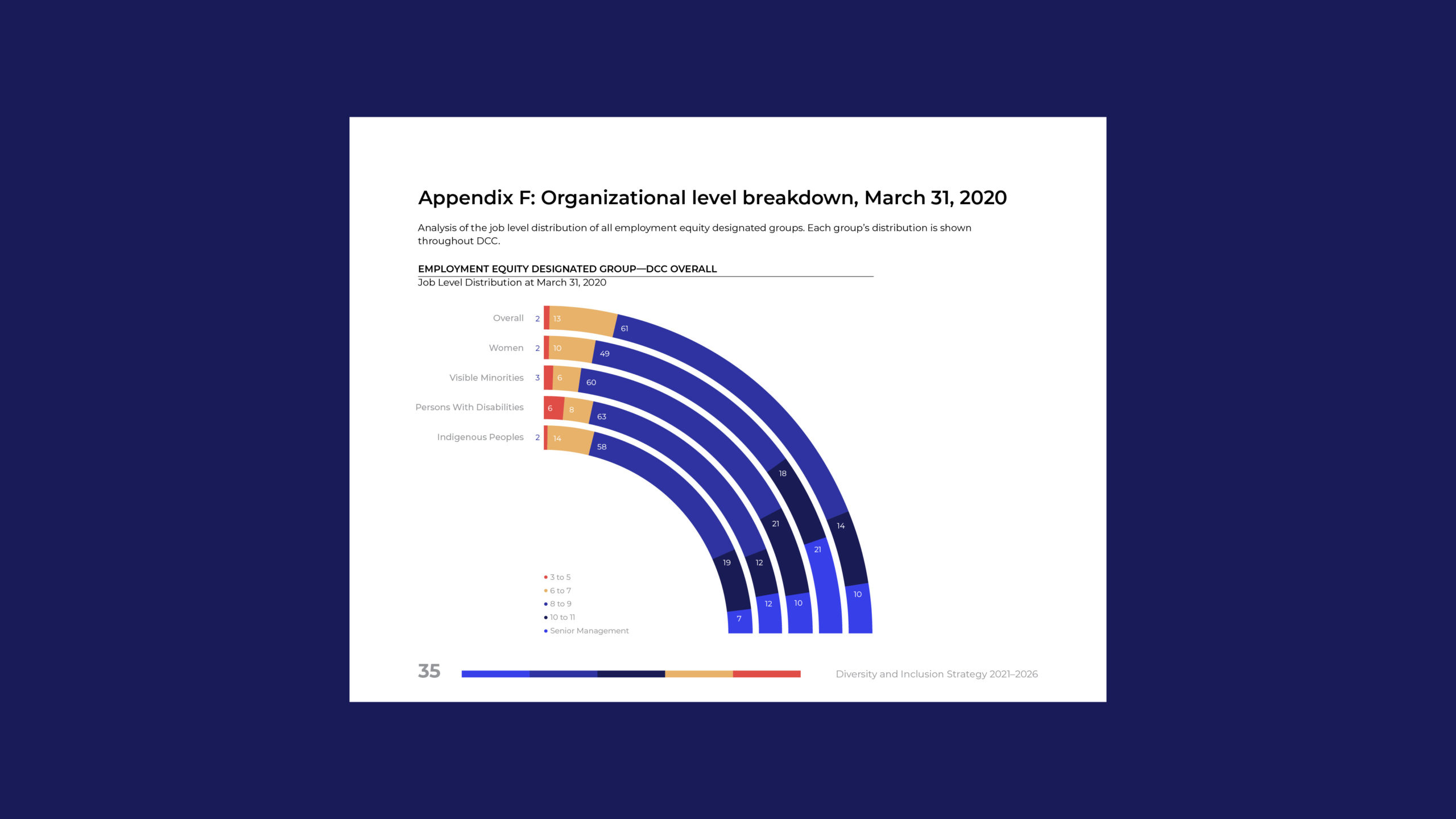
I have done DCC’s Annual Reports and Corporate Summaries for the last 11 years and it is always a great project. This year’s was particularly interesting because they had a new president who wanted to take it in a new direction.
My Role
Design · Layout · Photo Editing · Cover Illustration · Inforgraphics · Typography · Financial Tables
Love, Yourself
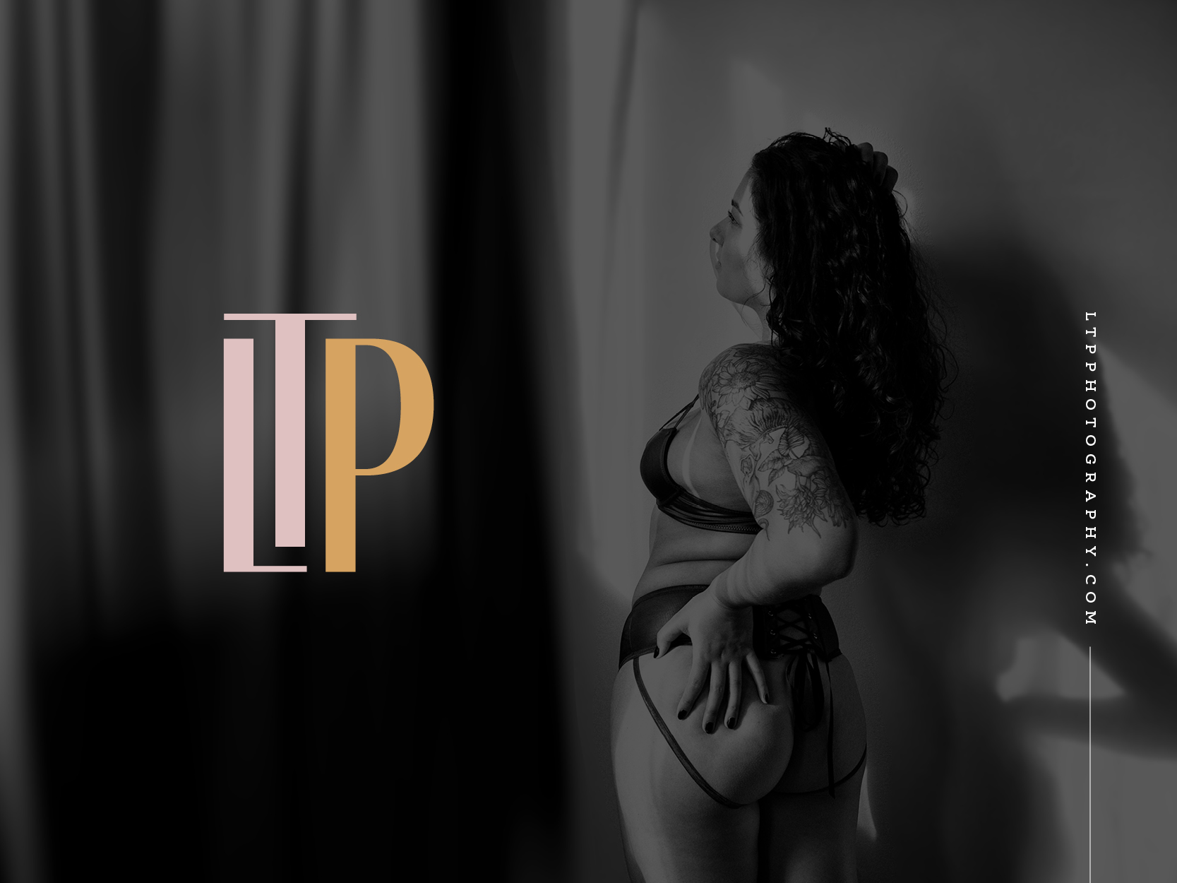

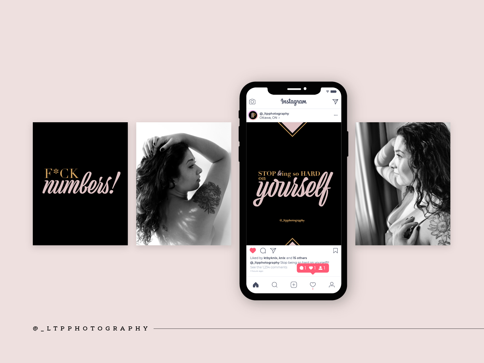
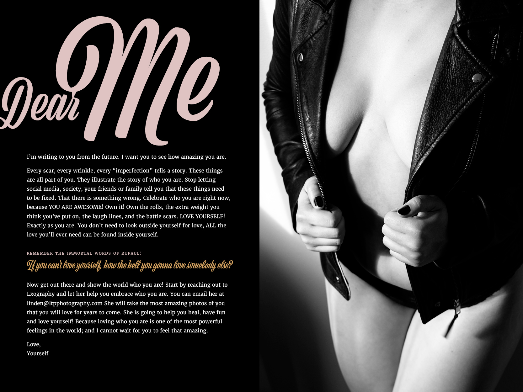
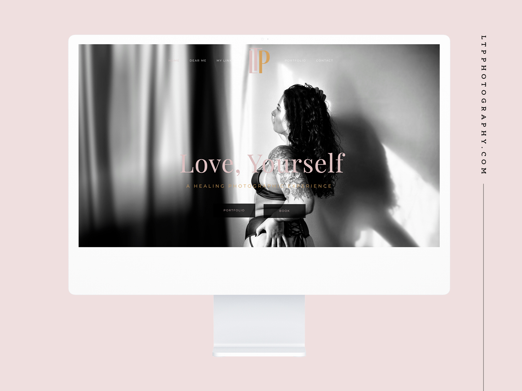
Love, Youself
Love, Yourself is a healing photographic experience. LTP Photography specializes in self-love and boudoir photography. The name, “Love, Yourself,” focuses on the project’s mission to have clients see themselves as a work of art worthy of their love. The photographic experience will throw off the patriarchy and help embrace every wrinkly, roll, and scar. Helping people celebrate all those things that society has deemed faults because they are the pieces of us that make us special.
My Role
Design · Layout · Photography · Photo Editing · Typography · Copywriting
Action Canada Annual Report
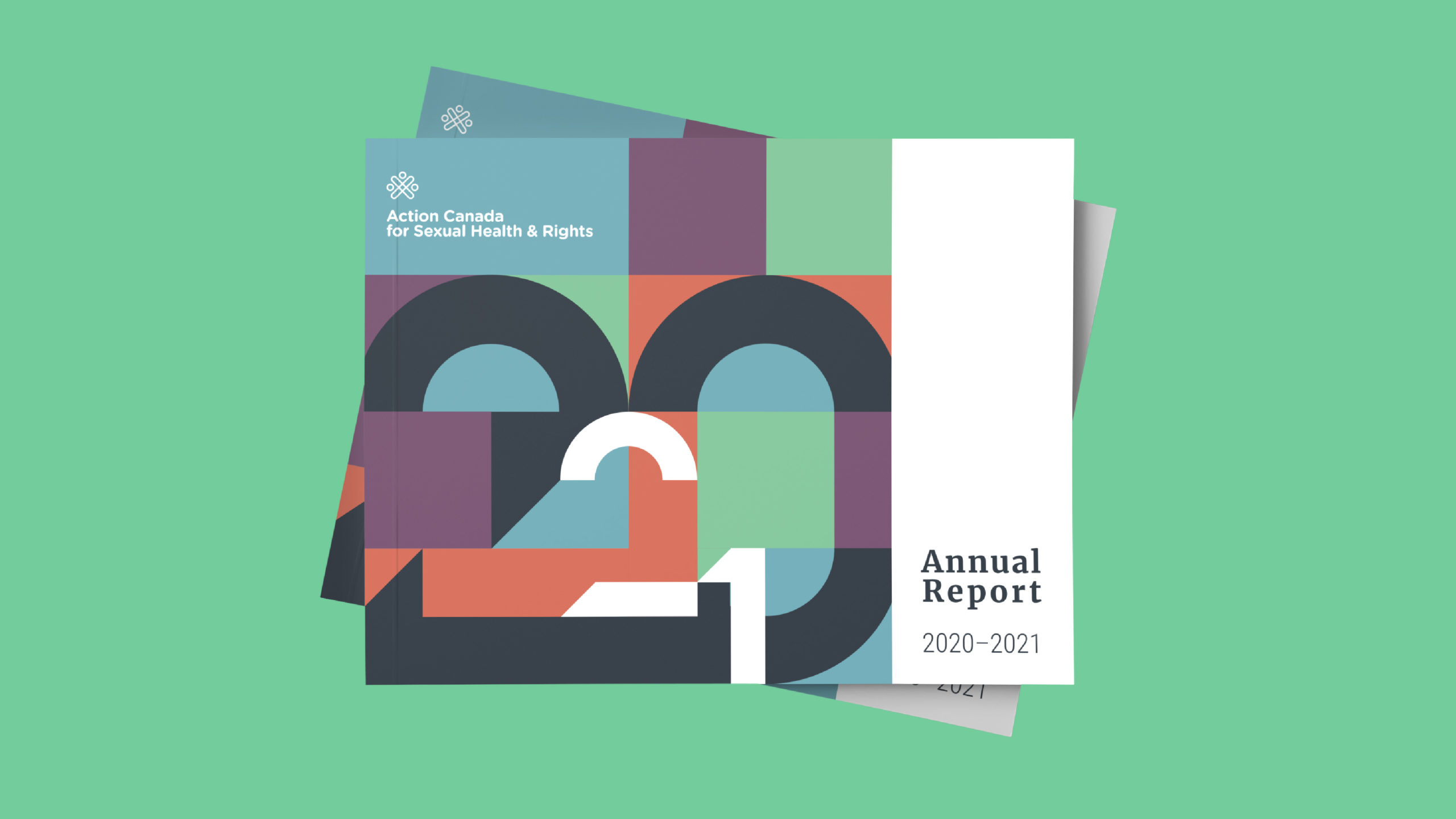
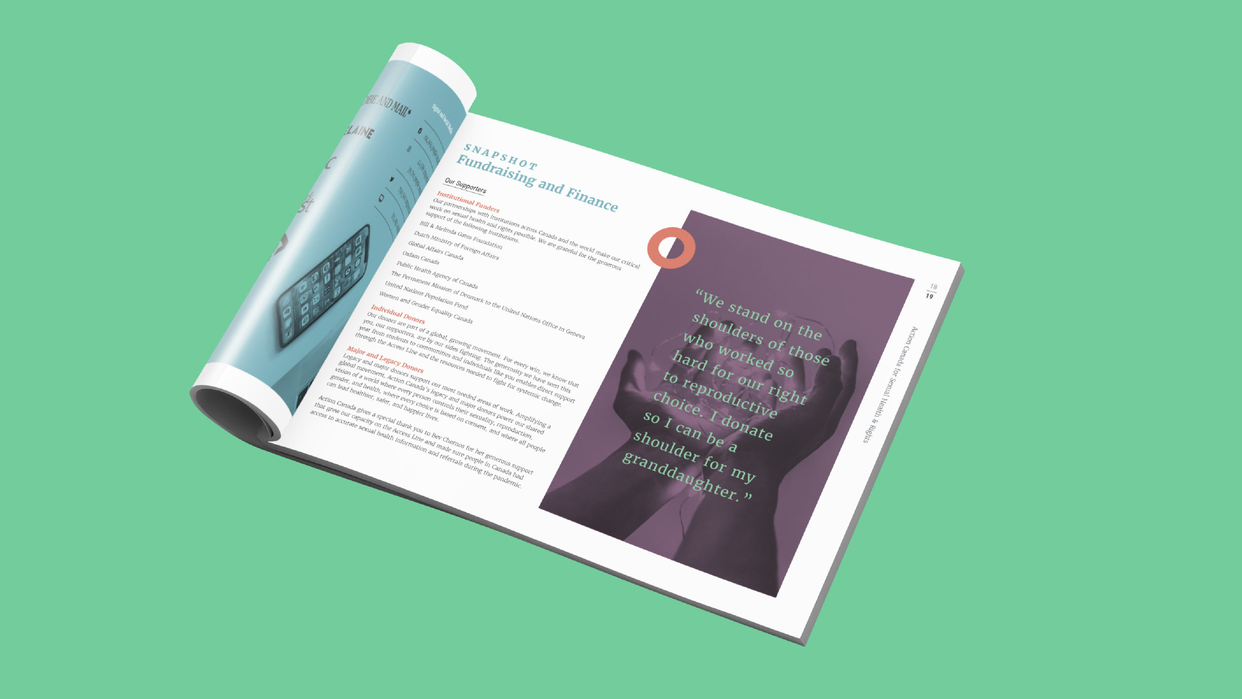
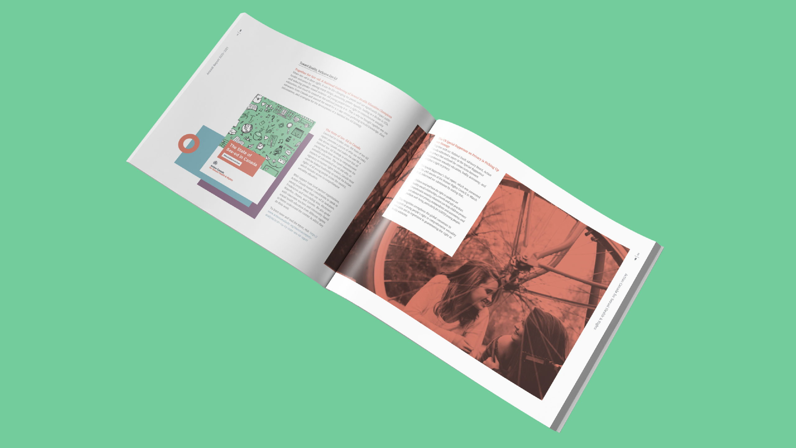
Action Canada Annual Report
Action Canada for Sexual Health and Rights is a non-profit organization based in Ottawa, Ontario. The client came to us wanting to do an annual report for the first time. This client was new to the process and very open to input. Being a non-profit they had a limited budget but they wanted something dynamic and modern, and something that truly represented their brand. One of the main challenges was text length, it’s hard to create white space (which they wanted) when the text is so heavy. But they were open to editing (to point) and understood that if they did not cut text that there would not be as much open space and breathing room. In the end this was and still is one of my favourite projects I’ve worked on and I am EXTREMELY happy with the final product.
My Role
Design · Layout · Photo Editing · Typography · Inforgraphics
Client
Action Canada for Sexual Health and Rights
Category
Annual Report · Design · Layout · Print


